Choosing a colour for your kitchen or bathroom can be terrifying. Staring at a wall of a thousand paint chips, how do you pick one you’ll love for years? The secret designers know is that the perfect colour isn’t found in a paint shop; the starting point is already in your home.
Step 1: Start With Your Fixed Elements and Undertones
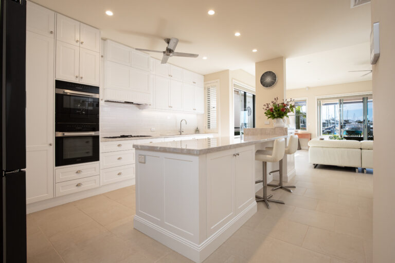
Before you pick a single paint chip, look at what you can’t easily change. These are your “fixed elements,” like countertops, floor tiles, and existing cabinet wood. These expensive, permanent finishes must dictate your palette, making the task of coordinating countertop and cabinet colours the true first step to a timeless look.
Have you ever painted a swatch of grey that suddenly looked purple on your wall? That’s a clashing undertone in action. An undertone is the subtle, background tint of a colour. A cool grey clashes with a warm honey-oak cabinet because its blue/purple undertone fights the cabinet’s yellow/orange one.
Making these hidden tints work together is crucial. The simplest trick is to hold a potential colour sample next to a piece of pure white paper. You’ll immediately see if it leans warm (yellow, red) or cool (blue, green). Matching the undertone of your new colour to your fixed elements is the most important rule for creating a beautiful, harmonious room you’ll love for years.
Step 2: Find Your Foundation With a Never-Fail Neutral
With the undertones of your fixed elements in mind, it’s time to choose your foundational colour. For a look that won’t feel dated in five years, this should be a versatile neutral. These colours create a calm backdrop that allows your countertops, hardware, and décor to shine, which is why they are consistently used for creating enduring paint colours for selling a house.
Most timeless palettes are built on one of three neutral families. The crucial decision depends entirely on which family best complements your existing undertones:
- Whites & Creams: The ultimate classic. Crisp, pure whites feel clean and modern (cool), while creamy, off-whites provide a softer, traditional warmth (warm).
- Greys: Sophisticated and versatile, greys can range from cool, steely blue-greys to warmer tones that almost touch beige.
- Beiges & Greiges: The perfect bridge. Warm beiges create a cosy feel, while “greige”—a mix of grey and beige—offers incredible flexibility, pairing well with both warm and cool accents.
To avoid being overwhelmed at the paint shop, only consider neutrals that share the same warm or cool undertone as your fixed elements. If your granite has warm gold flecks, you’ll want a warm cream or a warm grey, not a cool, blue-based one. This simple rule instantly narrows your choices, making it easy to find a winner from a curated list like the popular Benjamin Moore historical colors.
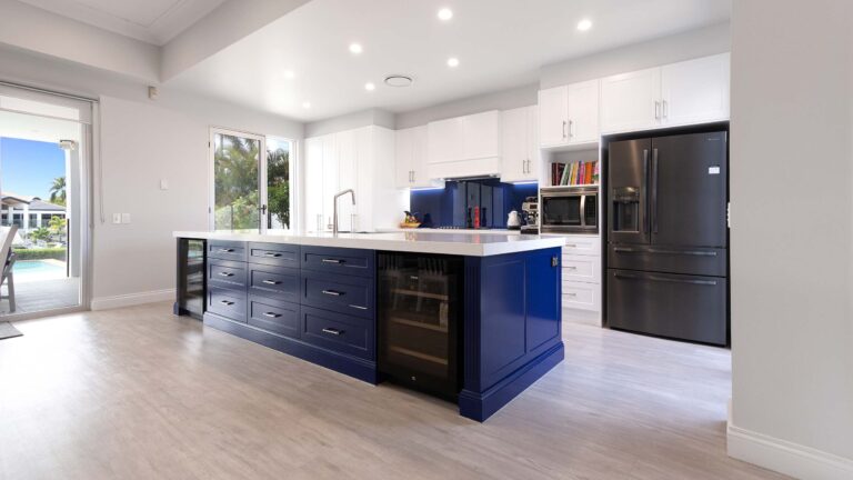
Step 3: Use the 60-30-10 Rule to Create a Balanced Palette
Once you have your neutral, how do you build on it without creating chaos? Designers use a simple guideline to achieve a balanced, professional look every time: the 60-30-10 rule.
Think of it like putting together a classic outfit: 60% of your space should be your dominant colour (the suit), 30% should be a secondary colour (the shirt), and a final 10% is reserved for a pop of an accent colour (the tie or pocket square).
In your kitchen or bathroom, that 60% is the foundational neutral you chose for the largest surfaces—usually your walls or main cabinets. The 30% secondary colour provides visual interest on a feature like an island or a bathroom vanity. This is the secret behind kitchen color schemes that won’t date.
Finally, that 10% accent is where you add personality. These are your accent color ideas for a neutral kitchen—the small, easy-to-change items like towels, artwork, or vases. This formula is how to create a cohesive color scheme that feels intentional and harmonious, not accidental.
How to Use Colour to Make a Small Bathroom Feel Bigger
The right colour choice can work wonders in a small, windowless bathroom. To create an illusion of space, lean into light, airy colours like soft greys, pale blues, and creamy off-whites. Using different shades of the same light colour for walls, trim, and the vanity—a trick called a monochromatic scheme—blurs the room’s edges and makes it feel more open. This is key to discovering what colors make a small bathroom look bigger while invoking the psychology of calming bathroom colors.
To be sure a colour is truly “light,” check its Light Reflectance Value (LRV) on the paint chip. This is a simple scale from 0 (pure black) to 100 (pure white). For a small bathroom, aim for an LRV of 60 or higher to ensure the colour will bounce the maximum amount of light around the room.
Beyond the colour itself, the paint’s finish plays a huge role. A satin or semi-gloss finish has a slight sheen that reflects light, amplifying the brightening effect. These are also the best paint finishes for high-humidity rooms because they create a durable, moisture-resistant surface that’s incredibly easy to wipe clean, making them the most durable bathroom paint finishes for a high-traffic space.
Your Final Touch: Adding Personality with Low-Risk Accents
That final 10% from the colour rule is your chance to inject personality and keep your neutral space from feeling one-note. This is where you make the room truly yours and add that final layer of polish that brings a design to life.
The secret is placing these colours on items that are easy and inexpensive to swap out. Consider vibrant hand towels, a piece of art, or a vase on the counter. By avoiding permanent fixtures like a colourful backsplash for your accent, you get all the visual impact with none of the long-term commitment.
This approach lets you flirt with trends without fear. When you tire of a bold colour, simply switch to accents drawn from a natural materials color palette inspiration—like wood or greenery—for a fresh look. It’s the ultimate low-risk, high-reward design choice.
A Simple Plan for a Palette You Won’t Regret
That wall of paint chips no longer has to be overwhelming. You now have a framework to transform guesswork into a clear, confident process for finding enduring paint colours that feel right in your home.
- Start with Your Fixed Elements. Identify their undertones first.
- Build with Harmonising Neutrals. Use the 60-30-10 rule for balance.
- Test, Test, Test. Never skip sampling the colour in your own space.
Before making a final choice, paint a large sample board and watch how the colour changes in your home’s unique morning, afternoon, and evening light. This single step provides certainty, ensuring a beautiful result you’ll love for years to come.
Ready to Transform Your Gold Coast Home?
Whether you’re planning a stunning new kitchen, a luxurious bathroom, or a complete home renovation, HASL is your trusted expert on the Gold Coast. Our team helps you bring your vision to life with timeless design and quality craftsmanship.
Contact HASL Today for a Consultation!
Explore our services: Renovations Gold Coast | Bathroom Renovations Gold Coast | Kitchen Benchtop Installation