Walk into any home after a scorching morning at Burleigh, and you instantly crave that physical drop in temperature. Designing effective coastal interior colour schemes for Gold Coast homes isn’t merely about aesthetics; it’s about creating a breezy atmosphere that offers genuine relief from the harsh Queensland sun. As seasoned professionals in home renovation and interior design, we know firsthand that achieving this delicate balance transforms a simple house into a tailored, functional sanctuary.
Environmental psychology studies reveal our perception of room heat is heavily influenced by our visual surroundings—a fascinating concept known as thermal-visual cooling. However, capturing this chilled feeling requires managing the intense, high-glare light bouncing off local waterways that easily washes out basic whites. To truly embrace the relaxed Gold Coast lifestyle, you must intentionally balance this blinding sunlight. By mastering a simple three-layer approach to your home’s palette, you can seamlessly transform overheated rooms into cohesive, shaded sanctuaries that resonate with your personal vision.
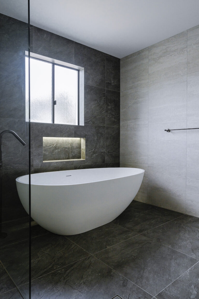
Beating the QLD Glare: Why Cool Whites with Grey Undertones Are the Secret to a Relaxing Living Space
We’ve all seen perfect Pinterest coastal homes, but when tried locally, creamy walls often look yellowish in the intense Queensland sun. Because our northern daylight is naturally hot, the choice between warm vs cool white paint for Queensland homes heavily relies on room orientation. North-facing rooms specifically need cool whites to balance that heat and feel like a true retreat.
Fixing this means looking at paint undertones and Light Reflectance Value (LRV)—simply put, a measure of how much glare bounces off your walls. To brighten a space without blinding your guests, you want light-reflecting paint finishes with a tiny hint of grey or blue (a cool undertone) to absorb the harshness. Our commitment to excellence means we never leave these details to chance when guiding clients through their renovations.
For the best white paint for Gold Coast natural light, try these local favourites:
- Dulux Lexicon Quarter: A crisp white with a cool undertone, perfect for cooling hot North-facing living areas.
- Dulux Vivid White: A pure white with zero undertones for ultimate clarity.
- Dulux Snowy Mountains Half: Features a subtle grey drop to soften intense afternoon glare.
Once your breezy, glare-free foundation is set, it is time to layer in your accents to bring the space to life.
Beyond the Nursery Blue: Using Dusty Navies and Muted Seafoams to Create a Grown-Up Seaside Vibe
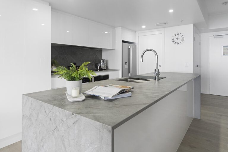
Getting the ocean vibe right is tricky; nobody wants a living space feeling like a toddler’s playroom. Sophisticated coastal interior colour schemes require muted tones rather than saturated ones. Instead of vibrant primary shades, look for colours with a subtle grey base to dial down the intensity and match our relaxed lifestyle. This principle is especially vital during comprehensive kitchen renovations, where cabinetry colour sets the mood for the entire open-plan living area.
To keep these elements balanced, we highly recommend the 60-30-10 rule. Your cool white foundation claims 60% of the room, while 30% goes to warming textures like timber furniture or jute rugs. The final 10% is reserved for your deeper pops of colour, creating gorgeous soft sand and ocean blue living room combinations effortlessly without overwhelming the eye.
Nature offers the perfect inspiration for spending that remaining accent budget. Introducing muted seafoam greens through linen cushions, matte ceramics, or thoughtfully selected tiles beautifully bridges the gap between your interior styling and the vibrant Queensland foliage just outside your windows.
VJ Panels and Navy Accents: Deciding Between Structured Hamptons and Organic Modern Coastal Styles
We’ve all admired homes along the Isle of Capri where bright spaces feel inviting, not stark. The secret is architectural texture. Using vertical joint (VJ) boards effortlessly adds structural depth and shadow to your walls without requiring you to change your foundation colour. Pair this grooved lining with our previously discussed dusty blue accents, and your design hits an exciting crossroads: Hamptons style vs modern coastal interior design.
Choosing your lane depends on whether you prefer polished luxury or a relaxed, organic approach. Whether you are browsing our renovation projects portfolio for inspiration or planning your own build, here is a quick comparison checklist to help define your space:
- Structured Hamptons: Showcases sophisticated navy and crisp white contrasts, classic VJ panelling, and polished chrome finishes. Perfect for those looking for a timeless, tailored aesthetic.
- Organic Modern Coastal: Celebrates imperfection with sage green accents, sandy warm undertones, raw oak timbers, and matte hardware. Ideal for a custom kitchen renovation that focuses on flow and natural materials.
Exploring VJ panelling paint ideas for seaside properties helps anchor either aesthetic beautifully in your home. Once your structural walls are set, you need durable materials that can handle sandy feet and humid Queensland afternoons.
Texture is Your Secret Weapon: Using Rattan and Oak to Ground Bright Palettes and Hide Coastal Wear
Fresh white walls in a newly painted Broadbeach apartment can occasionally feel cold. To fix this, we use visual weight—the design concept that rougher textures draw the eye and ground a bright space. When styling a coastal home with neutral textures, pieces like a chunky jute rug or a woven rattan chair act as their own colours, instantly injecting warmth into an otherwise stark room. This approach is incredibly effective in apartment renovations, where maximizing the perception of space and warmth is paramount.
Beyond aesthetics, these organic choices are deeply practical for our specific climate. As renovation experts dedicated to project longevity, we know that solid oak and treated rattan are resilient materials that easily withstand relentless Gold Coast humidity and the inevitable influx of sandy feet. Integrating natural timber tones creates a forgiving surface that hides daily wear while beautifully complementing cooler walls, especially when layering shades of aqua and driftwood across your living room cushions.
Think of these durable materials as the foundation keeping your home both functional and effortlessly breezy.
Your Weekend Transformation Guide: The 4-Step Checklist for a Cohesive Gold Coast Home Palette
You no longer have to guess which tones turn yellow in the Queensland sun. You now have the tools to build a cohesive coastal colour palette that works with the bright Gold Coast light, not against it. Before committing, avoid expensive mistakes by painting large swatches on cardboard. Move them around your room throughout the day to see how they react to that “hot” afternoon glare.
Execute your redesign confidently using this approach:
- Base White: Choose a cool-toned foundation to combat the heat.
- Accent Hue: Select a dusty blue or sage green for depth.
- Timber Tone: Add light oak or ash to ground the space.
- Texture Layer: Bring in rattan or linen to prevent flat walls.
Selecting paint colours for coastal spaces doesn’t have to be overwhelming. Start with your foundation tone to establish immediate balance, and watch your rooms transform into a cohesive coastal sanctuary that beautifully mirrors the relaxed local lifestyle. If you’re ready to take the guesswork out of your next major home transformation, reach out to our team for a professional design consultation, and let us bring your vision to life with expert precision and care.